Why dashboards don't motivate teams (and what does)
BI dashboards are built for analysis, not motivation. Here is why most of your team scrolls past them, and what actually gets people to care about the numbers.
· 6 min read · The Metafor team

Every SaaS company has a dashboard. Most have several. They are carefully built, refreshed in real time and shared in a Slack channel that almost nobody opens.
That’s not because the dashboards are bad. It’s because they were designed for a different job.
Dashboards are built for the left brain
A classic BI dashboard is minimalist, precise and analytical. It is made for someone who already knows what they are looking for: an analyst checking a hypothesis, a CFO reconciling a number, a manager drilling into a segment.
For that person, a dashboard is perfect. For everyone else (the account executive, the CSM, the new developer, the team at the all-hands) it is a wall of tiles that all look the same.
| BI dashboard | What the wider team needs | |
|---|---|---|
| Built for | Analysts, finance, controllers | Sales, CS, ops, the whole company |
| Job | Analyze and report | Inspire, align and celebrate |
| Feels | Precise, minimalist, abstract | Tangible, immersive, a bit fun |
When we ask a dashboard to motivate a team, we are asking an analysis tool to do a storytelling job.
Four reasons dashboards fall flat with teams
1. Numbers are abstract
“MRR: €840k, +2.1%.” Correct, important, and completely forgettable. A number has no shape, no place and no emotion attached to it.
2. Everything looks the same
A good month and a bad month produce the same grid of charts with slightly different lines. There is nothing to notice, so people stop looking.
3. There is no story
Dashboards show the current state. They rarely show the journey: where we started, what changed and who made it happen. Without that, there is no reason to care.
4. People can’t see themselves in it
A total hides the deals, the renewals and the saved accounts behind it. The people who did the work don’t see their work.
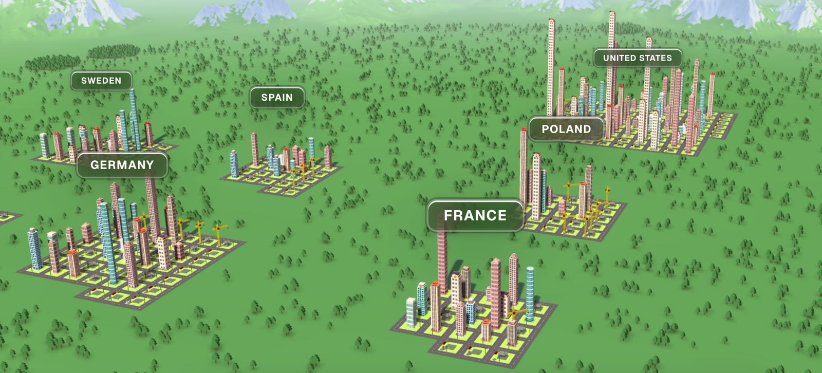 The same customers split into districts by country. Metafor product footage, sample data.
What does motivate a team?
None of this is new. Managers have always known what makes people care. The challenge is getting those things into how we share data.
- Progress you can see. People are motivated by visible progress toward a goal. A growing skyline, a filling bar or a map that changes colour beats a percentage.
- Recognition. Seeing a new customer appear, and knowing who closed it, is more powerful than a line in a report.
- A shared picture. When everyone looks at the same thing in the same meeting, alignment gets easier.
- Ritual. A monthly recap that the team looks forward to builds a habit around the numbers.
- A little play. Exploring something is more engaging than reading it. Games have understood this for decades.
Keep the dashboard, add a second layer
The answer is not to throw away your BI tools. Analysts still need precision. The answer is to add a layer on top that is built for the right brain: something that turns the same data into a picture and a story.
Some practical options:
- A monthly “wrapped” recap, in the spirit of the year-in-review formats people already love, showing what the team built this month.
- A visual on the office TV that people actually stop to look at.
- A celebration moment in the all-hands built around the customers you won, not the totals.
- A visual metaphor for the business, like a city where each building is a customer, so the state of the company can be understood at a glance.
How we approach it at Metafor
Metafor is built on that idea. It connects to your customer data and renders it as an interactive 3D city: every building a customer, every construction site a deal in progress. You can play the timeline and watch the city grow, split it into districts by market or account owner, and send a short Wrap of the month to the team in Slack or Teams.
It doesn’t replace your dashboards. It gives the rest of the company a reason to care about what’s in them.
Key takeaways
- Dashboards are excellent at analysis and poor at motivation, because that’s what they were designed for.
- Teams respond to visible progress, recognition, a shared picture, ritual and play.
- Keep your BI stack and add a storytelling layer built for the whole team.
Spreadsheets don’t motivate. Metaphors do. We’re opening Metafor to a small group of founding customers. Join the waitlist for early access.