What is data storytelling? A practical guide for revenue teams
Data storytelling turns numbers into something a team can follow, remember and act on. Here is what it means, why it matters for SaaS revenue teams, and how to start.
· 7 min read · The Metafor team
Most companies are not short of data. Their CRM knows every deal, every renewal and every churned account. The finance team has the MRR curve. Customer success has health scores. And yet, on Monday morning, many people in the company could not tell you whether the business is doing well.
That gap between having the numbers and understanding them is what data storytelling is meant to close.
A simple definition
Data storytelling is the practice of turning data into a narrative that people can follow, remember and act on.
It has three ingredients:
- Data: the facts. Revenue, customers, pipeline, retention.
- Visuals: a way to see the data, so the pattern does not have to be read out of a table.
- Narrative: a beginning, a middle and an end. Where we were, what changed, where we are now and what it means.
A chart on its own is visualization. A story on its own is opinion. Data storytelling is what you get when you combine them.
Why it matters for revenue teams
Revenue teams live closest to the numbers, but they also depend most on other people acting on them. A RevOps lead can build a perfect pipeline report. If sales, CS and leadership skim past it, nothing changes.
Data storytelling matters because:
- Numbers don’t motivate on their own. A 4% uplift in net revenue retention is a big deal, but it does not feel like one in a cell.
- Alignment needs a shared picture. When everyone sees the same story, conversations start from the same place instead of arguing about whose spreadsheet is right.
- People remember stories, not rows. A month told as “we won three new logos in Germany and lost one long-time customer” sticks. A table of 40 lines does not.
- It saves presentation time. Teams spend hours turning exports into slides for all-hands and board meetings. A clear story structure makes that faster.
Data storytelling vs. reporting
Reporting and storytelling are not rivals. They answer different questions.
| Reporting | Storytelling | |
|---|---|---|
| Question it answers | What are the numbers? | What happened, and why should I care? |
| Audience | Analysts, finance, managers who already know the context | The whole team, including people far from the data |
| Format | Tables, dashboards, filters | A sequence with a beginning, middle and end |
| Goal | Accuracy and completeness | Understanding and action |
You need both. The mistake is to assume a report will do the job of a story.
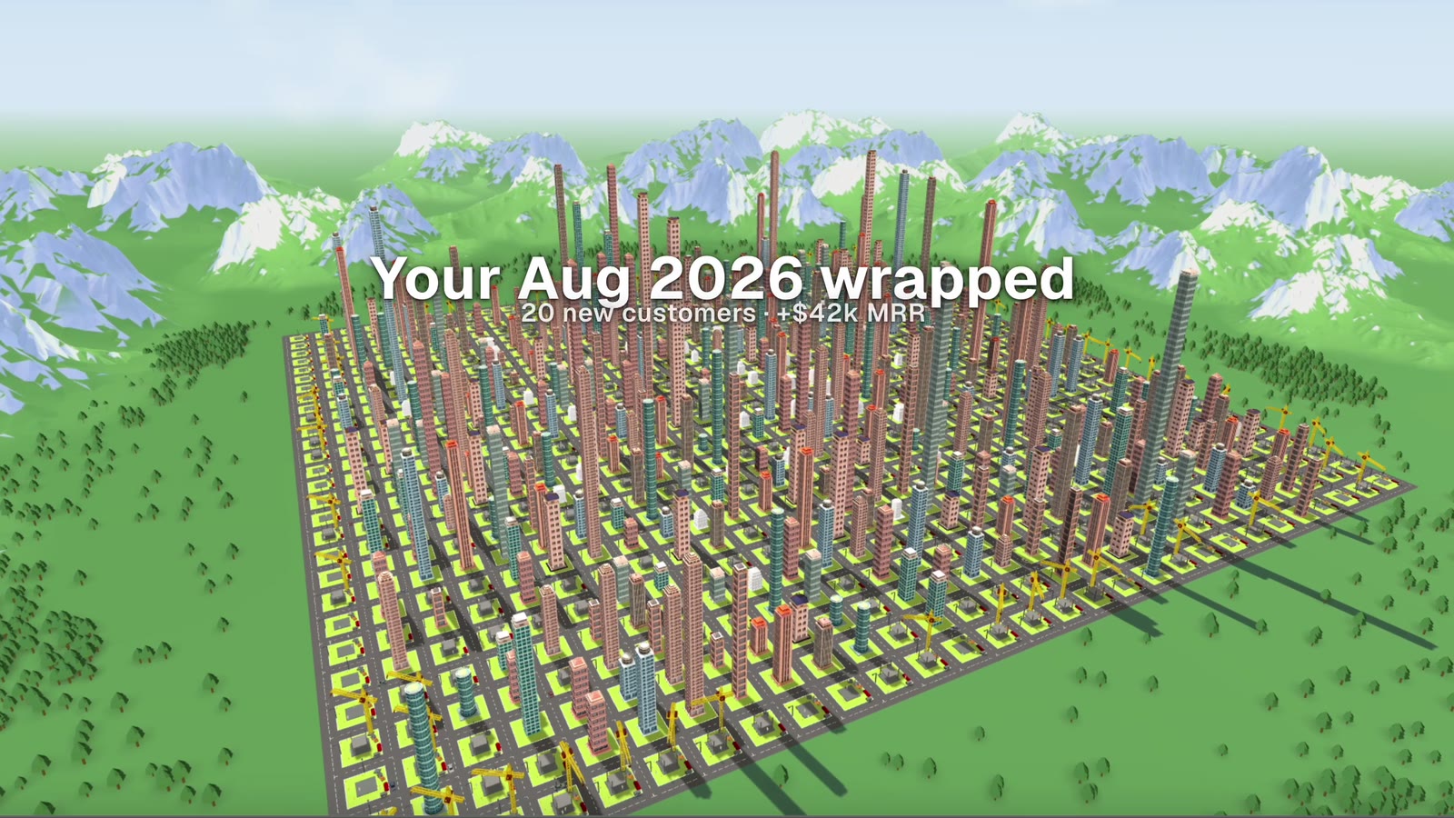
 The skyline at the end of a Wrap: where the month ended up. Metafor product footage, sample data.
The anatomy of a good data story
Whatever format you use (a slide, a video, a short post in Slack), strong data stories tend to share the same structure:
1. Start with the context
Where did we begin? “At the start of the quarter we had 112 customers.” The audience needs a reference point before change means anything.
2. Show the change
What moved? New customers, expansions, churn, a shift between segments. This is where visuals do the heavy lifting, because a change is far easier to see than to read.
3. Explain the cause
Why did it move? A campaign, a new market, a product release, a key account manager who changed jobs. Without a cause the story is just a chart.
4. Land on a meaning
So what? “We’re growing fastest in mid-market, so that’s where we’re adding a CSM.” The ending should make the next step obvious.
Five ways to start this month
You don’t need new tools to begin. Try these with what you already have:
- Replace one dashboard review with a story. In your next team meeting, pick three numbers and walk through context, change, cause and meaning.
- Name your customers. Talk about the accounts behind the totals. “Acme expanded” lands harder than “expansion MRR up”.
- Show time, not snapshots. A single number has no story. A number compared to last month, or the same month last year, does.
- Celebrate visibly. When a team closes a big deal or saves an at-risk account, make it visible to everyone, not just the people in the pipeline review.
- Make it repeatable. A monthly “what happened” recap, in the same format every time, builds a habit and a shared language.
Where visual metaphors come in
The hardest part of data storytelling is the visual. Bar charts and line graphs are precise, but they all look the same, and most people have learned to glance past them.
That’s why some teams are turning to visual metaphors: representing the business as something people already understand intuitively, like a growing city, a garden or a fleet. A metaphor gives every number a place and a shape, and it makes change something you can watch happen.
This is the idea behind Metafor. It connects to your customer data (HubSpot, Excel or Google Sheets, or any app via Zapier) and renders it as an interactive 3D city, where every building is a customer. You can play the timeline and watch the city grow, or share a short “Wrap” film of the month with the whole team.
Key takeaways
- Data storytelling combines data, visuals and narrative so people can understand and act.
- It complements reporting. Reports are for accuracy, stories are for alignment.
- A good data story has context, change, cause and meaning.
- You can start with the tools you already have, but visual metaphors make the visual part much easier.
Want to see your own customer data as a story? We’re opening Metafor to a small group of founding customers. Join the waitlist for early access.