3D data visualization: when a third dimension helps, and when it doesn't
3D charts have a bad reputation, often for good reason. But 3D worlds are a different thing. Here is when 3D data visualization adds real value, and when to stay flat.
· 7 min read · The Metafor team
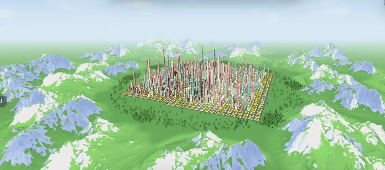
Ask a data visualization expert about 3D and you will probably get a sigh. 3D pie charts and tilted bar charts have earned their bad reputation: they distort values, hide data behind other data and add decoration without adding meaning.
And yet some of the most engaging ways to understand complex information are three-dimensional. Maps, games, architectural models and simulations all use 3D, and people spend hours exploring them.
So which is it? The answer depends on what you are trying to do.
The case against 3D charts
When the goal is to compare exact values, 3D usually hurts:
- Perspective distorts size. Bars closer to the viewer look bigger than bars further away.
- Things hide behind other things. Occlusion means some data is simply not visible from a given angle.
- Depth is hard to judge. People are good at comparing lengths on a flat surface and poor at judging depth on a screen.
- It’s often decoration. A third axis that encodes nothing is noise.
If your audience needs to read “which region had the higher Q3 revenue, and by how much”, a flat bar chart wins every time.
The case for 3D worlds
A 3D chart and a 3D world are different things. A 3D world isn’t trying to make you read values off an axis. It’s trying to give you a place to be in.
That changes what 3D is good for:
- Overview at a glance. A skyline shows the shape of a whole customer base in one view: where it is dense, where it’s tall, where something new is being built.
- Exploration. Moving through a space is intuitive. Zoom out for the big picture, fly in for detail.
- Memory and place. People remember where things are. A district or a landmark is easier to recall than row 47 of a table.
- Emotion and engagement. A world that grows in front of you feels like progress. It’s the difference between reading about a city and flying over it.
- Time. Animation in 3D shows change naturally: new buildings rise, districts expand, the skyline evolves.
 Flying down an avenue in Metafor’s fly-around mode. Metafor product footage, sample data.
A simple test: read or feel?
Before choosing 3D, ask what the audience should do with the visual.
| If the audience needs to… | Use |
|---|---|
| Read exact values and compare them precisely | Flat charts and tables |
| Find a specific record fast | Search, filters, tables |
| Understand the overall shape of something big | A 3D world or map |
| Explore and discover patterns on their own | A 3D world or map |
| Feel progress and celebrate it | A 3D world with animation over time |
| Present to a broad, non-analyst audience | A 3D world, with exact numbers on demand |
The best tools don’t force a choice. They use 3D for overview, exploration and emotion, and put the exact number one click away.
Principles for good 3D data visualization
If you do go 3D, a few principles keep it honest:
- Encode on purpose. Height, colour and position should each mean one thing, and the same thing everywhere.
- Let people move. A fixed 3D angle has all the problems of a 3D chart. Free movement solves occlusion and depth.
- Keep the numbers close. Hover or click to reveal the exact value. Never make someone guess.
- Use time. 3D is at its best when it shows change, not a single frozen state.
- Build on a metaphor. A world people recognize, like a city, needs no legend to get started.
Why this matters more as AI takes over
As more of the actual work moves to AI agents and automated workflows, teams risk losing sight of what they are achieving. The work happens somewhere in a pipeline; the results end up in a table. 3D worlds offer the opposite: a human-scale interface where you can see what you built.
How Metafor uses 3D
Metafor turns customer data into an interactive 3D city. Each building is a customer, and you can fly around the city with mouse or keyboard, play the timeline to watch it grow from your first customer to today, or split it into districts by country, industry or account owner. Point at any building and you see the customer details behind it.
It’s 3D used for overview, exploration and storytelling, with the exact numbers always close at hand.
Key takeaways
- 3D charts usually hurt precise comparison. Stay flat when people need to read values.
- 3D worlds are a different tool, strong for overview, exploration, memory and emotion.
- Ask whether the audience needs to read or to feel, and choose accordingly.
- Good 3D visualization encodes on purpose, lets people move and keeps the numbers close.
Curious what your customer base looks like as a city? We’re opening Metafor to a small group of founding customers. Join the waitlist for early access.